
Understanding Font Categories
Before you can pair fonts effectively, you need to understand what you’re working with. There are really four main categories of typefaces that designers use regularly.
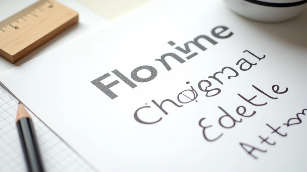
Serif fonts have those little lines at the ends of letters. They’re classic—think Times New Roman or Georgia. Sans-serif fonts don’t have those lines. They’re clean and modern. Then you’ve got display fonts, which are big, bold, and meant to grab attention. And script fonts, which look handwritten. Most successful pairings stick to the first two categories because that’s where you get real contrast without things looking chaotic.
The key insight? Each category has a personality. Serifs feel formal and established. Sans-serifs feel contemporary and approachable. Display fonts feel dramatic. When you’re pairing, you’re really mixing personalities, not just mixing letters.