
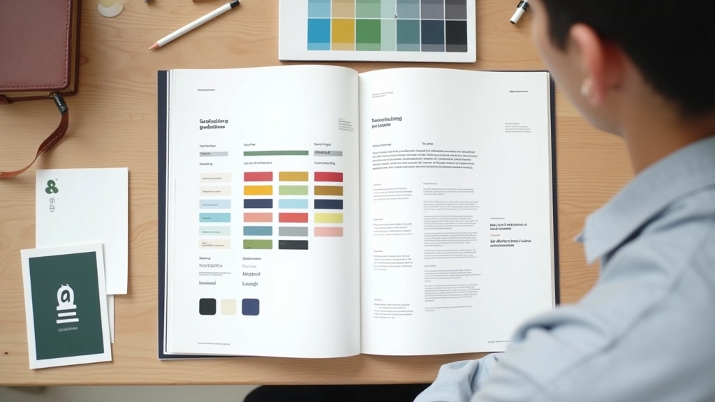
Understanding Color Harmony in Web Design
Learn how complementary, analogous, and triadic color schemes work. We’ll show you why certain colors naturally feel right together.
Your color choices affect readability. We’ll walk through WCAG standards and show you why contrast ratios matter for every user who visits your site.

Most designers focus on aesthetics first. That’s natural. But here’s the thing — a beautiful color palette doesn’t matter if people can’t actually read your content. We’re not just talking about users with visual impairments. We’re talking about someone reading your website in bright sunlight on their phone, or an older visitor with age-related vision changes, or anyone with astigmatism trying to parse thin gray text on a white background.
WCAG 2.1 (Web Content Accessibility Guidelines) exists to solve this. It’s not bureaucracy — it’s a framework built from research about how humans perceive text and color. When you meet WCAG standards, you’re not just making your site accessible. You’re making it better for everyone.
Level AA contrast (4.5:1 for normal text) isn’t a suggestion. It’s the minimum your site should meet. Level AAA (7:1) is the gold standard, but start with AA and you’re already ahead of most websites.

Contrast ratio is a mathematical comparison between the lightness of your text and the lightness of its background. It’s calculated on a scale from 1:1 (no contrast, same color) to 21:1 (maximum contrast, like pure black on pure white).
Here’s what you actually need to know: WCAG defines three levels of success. AA is the standard most organizations target. It requires 4.5:1 contrast for normal text (14px and below) and 3:1 for large text (18px and above, or 14px bold). AAA, the stricter standard, demands 7:1 and 4.5:1 respectively. Most websites aim for AA because it’s achievable while maintaining visual flexibility.
The tricky part? Contrast isn’t subjective. Your eye might think gray text looks fine, but if it doesn’t meet the ratio, it fails accessibility standards. That’s why tools matter.


WCAG has three levels: A, AA, and AAA. Most projects target AA. That’s where the 4.5:1 rule comes in. Normal body text on your site needs that ratio minimum. This affects everything — your primary text color against background, buttons with text, form labels, captions.
Large text gets a break. If your text is 18px or larger (or 14px if bold), you only need 3:1 contrast. That’s why headings can use slightly lighter colors than body copy.
You don’t need to calculate ratios manually. Tools handle that. Here’s what actually works.
Free online tool. Enter your foreground and background colors (hex or RGB), and it tells you the ratio instantly. Shows you if you pass AA, AAA, or neither. It’s the fastest way to check individual color combinations.
Install on Chrome or Firefox. Scan any live webpage and get a report of contrast failures, missing alt text, and other accessibility issues. Integrates directly into your dev workflow.
Built into Chrome. Right-click an element, inspect it, go to the Accessibility panel. It shows contrast ratio and whether you pass WCAG standards. Handy during development.
Theory is fine, but here’s where it matters. You’re designing a portfolio site. You pick a trendy light gray (#999999) for secondary text on white. Looks sophisticated on your monitor. But that’s only 5.7:1 contrast — it fails AA for body text. Someone with low vision or reading your site outdoors will struggle.
Or you’re building an e-commerce checkout. Your CTA button is dark navy text on a navy background to look subtle. Contrast ratio? 1.2:1. Basically unreadable. That button should have white text on that navy — 8.5:1 ratio, passes AAA easily.
The good news? Meeting contrast requirements doesn’t mean your design has to be boring. You’ve got plenty of room to be creative. Dark backgrounds with light text? Easy to hit high contrast. Colorful backgrounds with white text? Works. Complementary colors with the right lightness values? Totally possible. You’re just being intentional instead of guessing.

Making your site accessible isn’t complicated. Start here.
Use Axe DevTools or WebAIM to scan your site. Identify all text-background combinations that fail. Document which ones matter most (body text > secondary labels).
If your secondary text fails, don’t change the hue. Make it darker or lighter. Go from #999999 to #666666. Same color family, better contrast. This preserves your design intent.
Remember, large text (18px+) only needs 3:1. Your body copy at 14px needs 4.5:1. You might be able to use a lighter shade for headings than for paragraph text.
Buttons, links, form inputs — they all need contrast too. Focus states matter. If you have a light gray button, make sure the text is dark enough.
WCAG guidelines represent best practices for web accessibility. While we’ve covered the core contrast requirements here, accessibility encompasses much more — alt text for images, keyboard navigation, screen reader compatibility, and more. These guidelines are informational and intended to help you understand accessibility principles. For specific compliance needs or legal requirements in your jurisdiction, consult with accessibility specialists or legal advisors. This article provides educational information about color contrast and WCAG standards, not definitive compliance advice.
You’ve probably realized by now that contrast isn’t about limiting your design. It’s about being intentional. Every color choice becomes a decision, not an accident. When you know your contrast ratios, you can confidently pick colors that work for everyone — regardless of their vision, their device, or their lighting situation.
Start small. Check your body text. Make sure it passes 4.5:1. Then work through headings, buttons, links, form fields. Use the tools. They’re free. Once you build this habit, you’ll never design gray-on-white again.
Your users will notice. They might not know why your site feels easier to read. They’ll just know it works for them. And that’s the whole point.