Why Consistency Matters More Than You Think
A design system isn’t just a collection of rules. It’s the foundation that lets your brand speak with one voice across every touchpoint. When your color palette and typography work together intentionally, users notice. They don’t consciously think about it, but they feel it.
We’ve all visited websites that feel disjointed. Different fonts on different pages. Colors that clash. Spacing that seems random. These aren’t accidents — they’re signs of a design that wasn’t built with a system in mind. And here’s the thing: building a system doesn’t mean everything looks boring or identical. It means every variation feels intentional.
The real power comes when you establish constraints. You’ll pick 2-3 fonts maximum. You’ll define 8-12 core colors. You’ll create spacing rules that scale responsively. Then within those constraints, you create flexibility. Different sections can feel distinct while still belonging to the same family.

About This Guide
This article is an educational resource designed to help you understand design system principles. It’s based on industry best practices and real-world design methodologies. Your specific project needs may vary — always adapt these principles to fit your unique context and audience.
Building Your Color Foundation
Start with your primary color. This is the workhorse of your palette — the color that appears most often. It should reflect your brand personality. Is it energetic? Professional? Calm? Your primary color sets the tone for everything else.
Next, pick 1-2 secondary colors. These provide variation and draw attention to specific elements — buttons, highlights, calls to action. Secondary colors should complement your primary without competing for attention. Complementary color schemes work beautifully here. If your primary is blue, a warm orange secondary creates natural contrast.
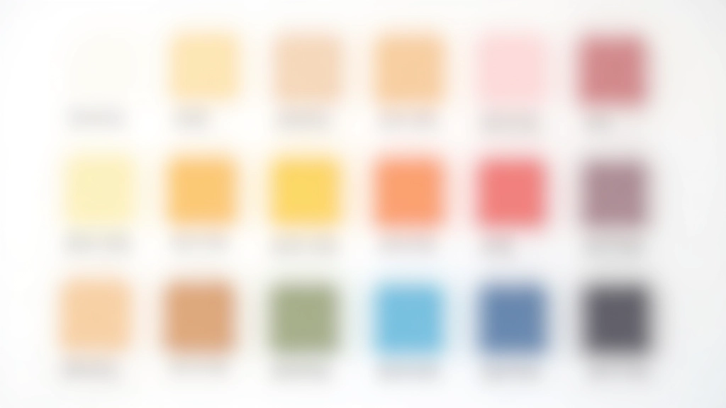
Don’t forget neutrals. You need at least 4-5 neutral shades: a true neutral (for backgrounds), a light gray (for secondary backgrounds), a medium gray (for borders), and 1-2 darker neutrals (for text). These are the glue that holds everything together. They’re not flashy, but they’re essential.
Pro tip: Document your colors using multiple formats. Hex codes for developers. RGB for digital. CMYK if you’re printing. HSL values help you create consistent tints and shades.
Typography: The Hidden Structure
Your typography system is what users read first. It’s not decoration — it’s the primary communication tool. That’s why it deserves serious thought. Pick a typeface family for headings and a different one for body text. This creates visual distinction without feeling chaotic.
Most designers choose a serif typeface for headings (like Georgia or Playfair Display) paired with a clean sans-serif for body text (like Open Sans or Inter). The contrast makes the hierarchy immediately obvious. But this isn’t a rule — it’s a pattern that works well.
Define your type scale in advance. Don’t just pick sizes randomly. Use a mathematical ratio — like 1.25 or 1.5. If your body text is 16px, your next size up is 20px (16 1.25). Then 25px. Then 31px. This creates harmony. Every size feels intentional.
And line height matters. At 16px font size, a line height of 1.6 (25.6px) reads comfortably. Tighter line heights feel cramped. Looser ones feel spacious. Test what works for your audience. Then document it.


Spacing and Grid: The Invisible System
Here’s what separates amateur design from professional: spacing systems. Most designers don’t think about this. They space elements by eye. It works sometimes, but it’s not scalable. It’s not consistent.
Use an 8px base unit. Everything scales from there: 8px, 16px, 24px, 32px, 48px, 64px. Padding, margins, gaps between elements — all multiples of 8. This creates a mathematical harmony that users feel even if they can’t see it.
For your layout grid, use 12 columns. This divides evenly into 1, 2, 3, 4, 6, or 12 columns. Maximum width of 1200-1440px gives breathing room on desktop while staying readable. Adjust your gutter width (space between columns) based on screen size — wider on desktop, tighter on mobile.
Putting It Together: Real Application
Let’s say you’ve built your system. You’ve got your colors documented. Typography is locked in. Spacing rules are clear. Now what? How do you actually use this?
Start with your most-used components. Navigation. Buttons. Cards. Form inputs. Build these first using your system. Then expand to page templates. Homepage. Article pages. Product pages. Each one should feel like it belongs to the same family but serve its specific purpose.
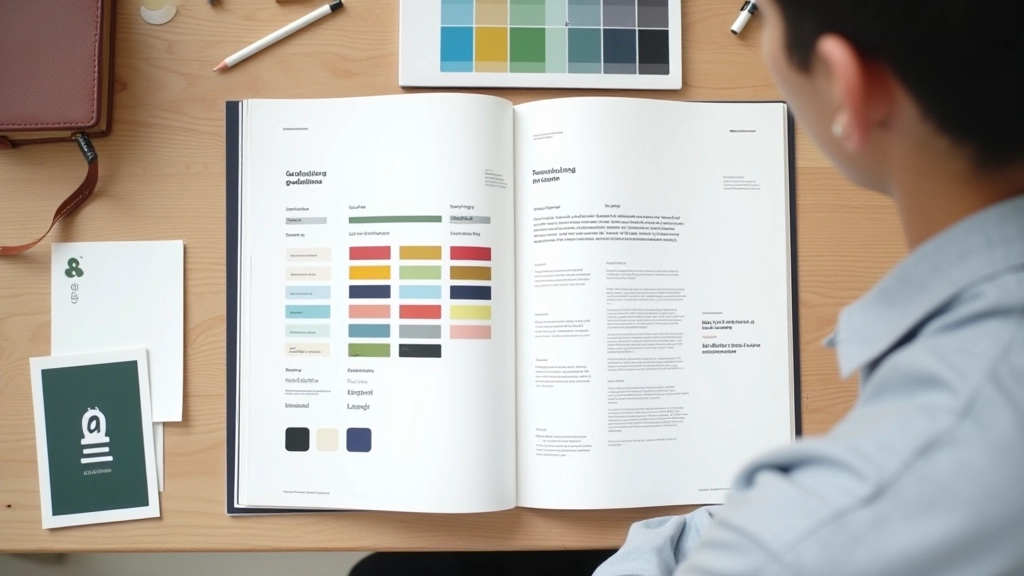
Document everything. Create a living design system document. Include color swatches with hex codes. Typography examples with size and weight. Component examples with code. This becomes the reference for every future design decision. It saves time. It prevents debates. It’s the source of truth.
Audit your current design. What colors are you already using? What fonts? This is your starting point.
Choose 3 core colors max. Primary, secondary, and accent. Add 4-5 neutrals. Test contrast ratios.
Select 2 typeface families. One for headings, one for body. Define your type scale using a ratio.
Create spacing and grid rules using 8px base units. Document everything in a design system file.
Build components using your system. Test across different screen sizes. Refine based on real usage.

The System Evolves With You
Your design system isn’t finished the day you create it. It grows. You’ll add new components. You’ll refine existing ones. You’ll discover edge cases that force you to rethink spacing or typography. That’s normal. That’s healthy. A living system is better than a perfect one that nobody uses.
The goal isn’t perfection. The goal is consistency. Intentionality. When every design decision comes from your system, your work feels professional. Polished. Coherent. That’s what users feel. That’s what builds trust. And that’s what makes your design system worth the effort it takes to build.