
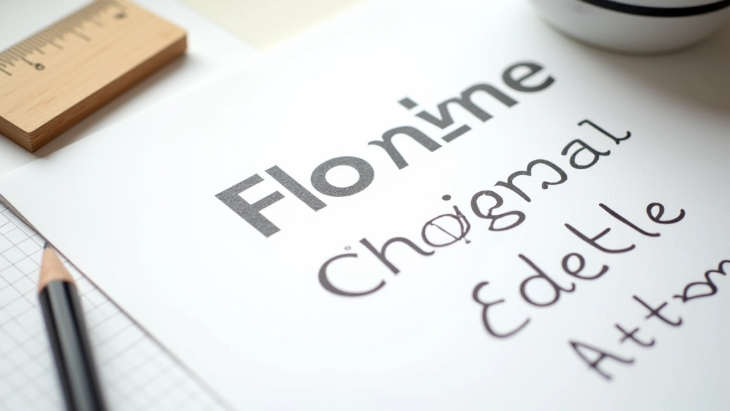
Choosing Typefaces That Work Together
Pairing fonts isn’t random. Discover the actual rules for combining serif and sans-serif typefaces.
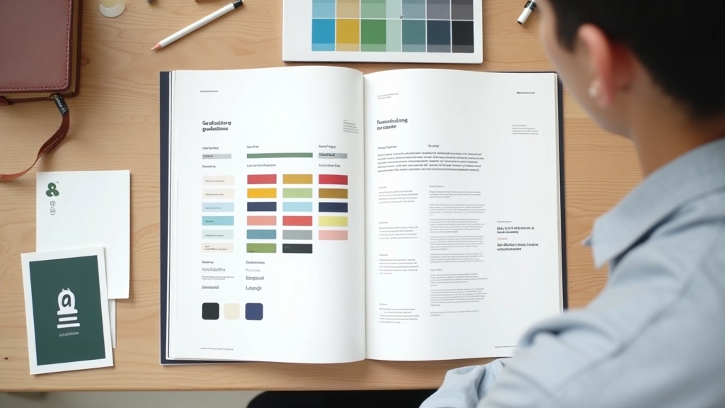
Learn how complementary, analogous, and triadic color schemes work. We’ll show you exactly why certain color combinations feel right and others clash.

Color harmony isn’t magic. It’s actually pretty straightforward once you understand the basic principles. When colors work together, your design feels cohesive and balanced. When they clash, viewers get uncomfortable without knowing why.
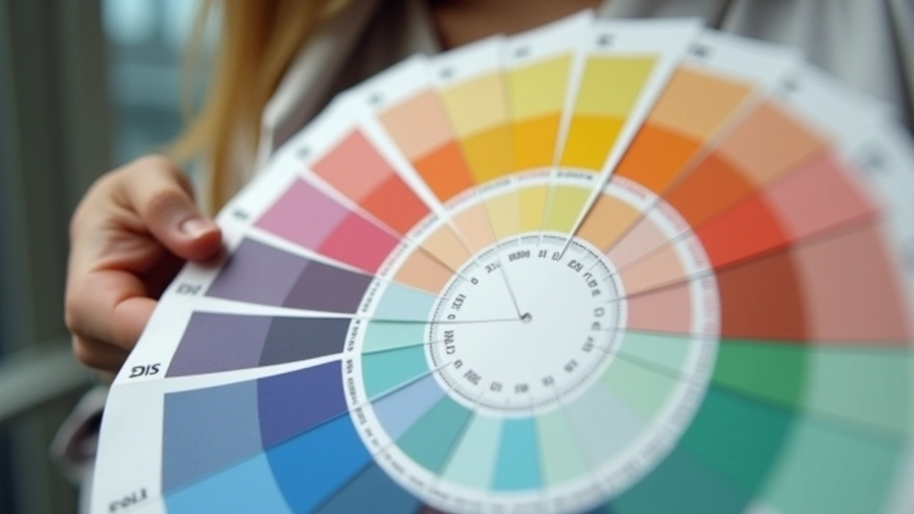
The thing is, harmony comes down to relationships between colors on the color wheel. Different relationships create different moods. Some combinations feel energetic. Others feel calm. Some feel sophisticated. The key is understanding which relationship you’re using and why.
There’s no single “best” color combination. Instead, there are five proven approaches. Each creates a different feeling and works in different contexts. Let’s walk through them one by one.
Colors directly opposite on the color wheel. Blue and orange. Red and cyan. They’re vibrant and create maximum contrast. Use this when you want energy and excitement.
Colors sitting next to each other. Blue, blue-green, green. They’re naturally harmonious because they share similar wavelengths. Perfect for calm, cohesive designs.
Three colors equally spaced on the wheel. Red, yellow, blue. Or green, purple, orange. Balanced and vibrant without being overwhelming like complementary pairs.

Here’s a practical framework that works almost every time: 60% dominant color, 30% secondary, 10% accent. This ratio creates balance without looking boring.
Your dominant color sets the mood. It’s what covers most of the page — typically your background or primary brand color. The secondary color supports it. Maybe it’s your text, some UI elements, or accent areas. And your accent? That’s the pop. The 10% that draws attention to important buttons, links, or highlights.
Why does this work? It’s about visual weight. Too much of a bright accent color exhausts the eye. Too little and it gets lost. Sixty-thirty-ten gives your brain exactly what it needs to process the hierarchy without getting overwhelmed.
Two colors can be the same hue but feel completely different based on how saturated they are and how light or dark. This is where most people struggle.
Key insight:
A fully saturated neon blue next to a desaturated dusty blue might technically be the same hue, but they create totally different energy. The desaturated version feels sophisticated. The neon feels aggressive.
Saturation controls intensity. Lightness controls approachability. You can pair virtually any two hues if you manage these variables well. A bright yellow next to a muted burgundy works. A desaturated yellow next to a bright burgundy? Usually clashes.

This article covers foundational color theory principles used in web design. While these guidelines provide a strong starting point, actual color perception varies based on individual viewing conditions, monitor calibration, lighting, and personal color vision. For accessibility requirements, always verify your color combinations meet WCAG contrast standards using contrast checking tools. Consider testing your designs with real users and monitoring how colors appear across different devices and lighting conditions.
Color harmony doesn’t require perfect technical knowledge. It requires understanding a few core principles and then trusting your eye. Start with one of the five harmony types. Apply the 60-30-10 rule. Pay attention to saturation and lightness. And most importantly, test your choices with real content on real screens.
The designers who excel aren’t the ones who memorize color theory. They’re the ones who understand why colors work together and apply that understanding thoughtfully. You’ve got the framework now. The rest comes from practice and observation. Start noticing how colors make you feel when you browse websites. That intuition, combined with what you’ve learned here, will sharpen your color decisions significantly.
Dive deeper into color and design with our related guides.