
Understanding Color Harmony in Web Design
Learn how complementary, analogous, and triadic color schemes work. We’ll show you exactly why certain color combinations feel right and others clash.
Read ArticleMaster the fundamentals that separate good design from great design. Learn how colors work together and why typography matters in every project.
Articles designed to build your understanding step by step
Learn how complementary, analogous, and triadic color schemes work. We’ll show you exactly why certain color combinations feel right and others clash.
Read Article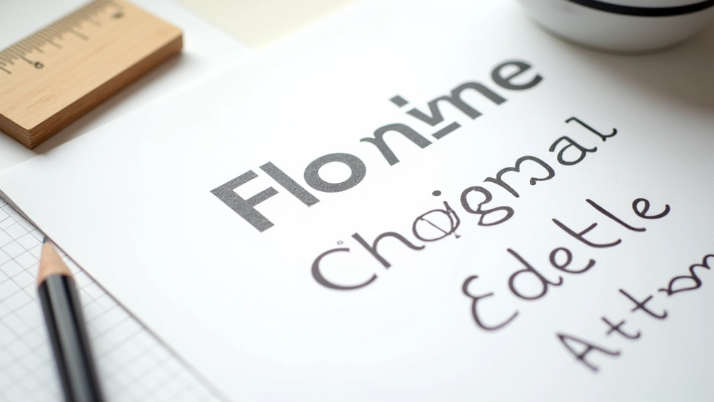
Pairing fonts isn’t random. Discover the actual rules for combining serif and sans-serif fonts that’ll make your layouts look intentional and polished.
Read Article
Your color choices affect readability. We’ll walk through WCAG standards and show you why contrast ratios matter for every user who visits your site.
Read Article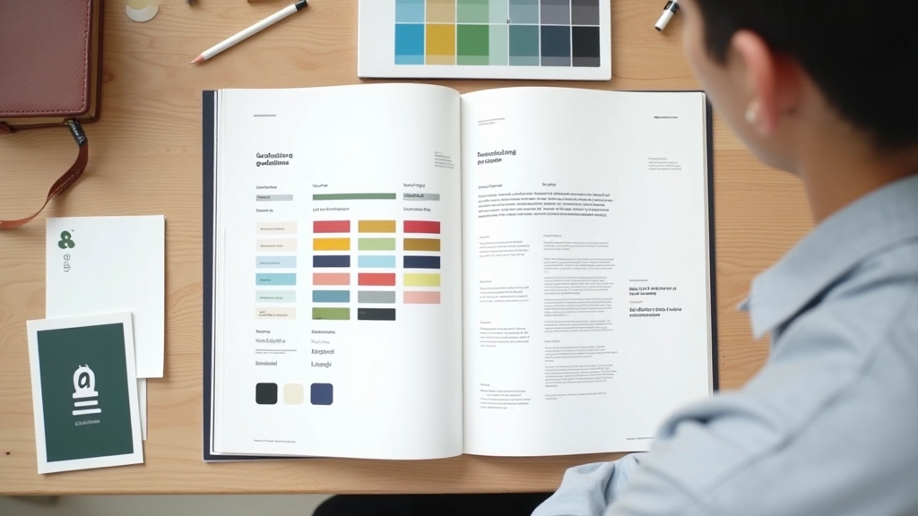
Create a design system that feels unified. You’ll learn to establish color palettes and typography scales that work across every page and stay consistent without feeling repetitive.
Read ArticleFollow these steps to build mastery in color and typography
Begin by understanding the color wheel and how hue, saturation, and brightness interact. Most designers skip this but it’s the foundation for everything else. You’ll spend about a week here if you’re new to design.
Move into fonts and typefaces. Learn the difference between serif and sans-serif, how to set proper line height, and why kerning matters. This isn’t theoretical — you’ll apply it to actual projects immediately.
Apply color and typography together on actual design work. Create mockups, build websites, design marketing materials. You’ll see where these principles matter most and develop your eye for good design naturally.